| VIEW |
|
Time Lines
|
If checked, lines marking the time frame
the chart spans (i.e., hours, days, months, etc.) are visible.
|
|
Price Lines
|
If checked, lines marking various price
levels are visible.
|
|
VAP
|
If checked, lines marking where the highest
Volume Average Prices have occurred.
Stock symbols and price and volume data shown here
and in the software are for illustrative purposes only. Charles Schwab
& Co., Inc., its parent or affiliates, and/or its employees and/or
directors may have positions in securities referenced herein, and may,
as principal or agent, buy from or sell to clients.
|
|
Info Window
|
The Info Window provides the statistical
data for the point on the chart you have clicked on. When you first open
the window from the pull-down, today's data will be displayed. To change
the displayed data, either left-click on a specific point on the chart
or hold down the left mouse button and move the mouse to find the date
you want.
If you haven't made any changes to the chart,
the data in the window will include that day's Open, High, Low, Close,
Volume, and BOL (Bollinger Bands). When you add more studies to the chart,
they will also appear in the window. As you increase the number of viewed
studies, you may not be able to see all of the statistical data in the
window. To view all of the data available, you may need to resize the
window by dragging the corner with the cursor until the all data is displayed.
|
|
NOTE: You
can access Settings, Views, Tools, and Trend lines by either using the
respective pull-downs or right-clicking on the chart.
|
| SETTINGS |
|
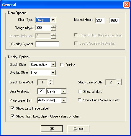
GENERAL
|
|
Data Options
|
|
Chart Type
|
Choose the period the chart will be based on: Monthly,
Weekly, Daily, Intraday,
or Ticks.
|
|
Range (days)
|
Enter number of periods up to 240 months for Monthly charts, 3,000 days
for Daily charts, 250 weeks for Weekly charts, 30 days for an Intraday
chart.
NOTE:
The
number of days available on an Intraday chart decreases along with your
Interval setting. For instance, if you choose 1 minute intervals, you
will only see 4 days of data; however, as you increase your interval,
you can increase the number of days back available to view. 60 days of
Intraday charts are only available when the interval is 10 or higher in
intervals of 5. For example you can get 10 days for Intervals of 10, 15,
20, 30, 60. You can only get 5 days for Intervals of 1-5 minutes or any
other number that is not devisable by 5.
|
|
Interval (minutes)
|
Applicable to Intraday charts only.
|
|
Overlay Symbol
|
Enter a symbol to overlay on your chart.
|
|
Market Hours
|
Enter the hours you want chart data for in military time (for example,
1600 for 4:00 p.m. ET).
NOTE: Beginning
time can be no earlier than 0600 and no later than 0930 ET. Closing time
can be no earlier than 1600 and no later than 2000 ET.
Default times are for the standard session only (09:30 to 16:00 ET).
As extended hours quotes are only available streaming, it is possible
to have gaps in you chart if you ask for all session times (i.e., 0600
to 2000 ET). The only way to view this data consistently on a chart is
to leave that chart open during Pre Market or After Hours Sessions.
If you switch stocks within the same chart, this will generate gaps as
the data is not presented to the chart while open. Charts will not populate
data for times prior to when the chart was opened, regardless of the settings
of the chart.
|
|
Chart 60 Min Bars on the Hour
|
If checked, starting at 10:00 a.m. ET, a chart using 60 minute bars
will be based on the hour (10-11, 11-12, etc.) rather than the half-hour
(9:30-10:30, 10:30-11:30, etc.)
|
|
Use % Scale with Overlay
|
When overlaying another symbol
on the chart, checking this box will change the display to a percent scale.
Percentages are based off the performance over the time period (intraday,
daily, monthly, etc.)
TIPS:
- For the
classic look, a line chart can be selected with a line overlay. Go
to Settings >
Colors to configure the colors of these lines for best display.
- The current
price will display in the right-hand scale that defines the percentages.
To remove that display go to Settings
> General and uncheck the Show
last trade label box located at the bottom of that window.
- Use a support
or resistance line and place it at the zero percent level. This
level can be easily located as the starting point on the left when the
symbol and overlay begin plotting.
- Use the
crosshairs to see the exact percentage numbers.
Stock symbols and price and volume data shown here
and in the software are for illustrative purposes only. Charles Schwab
& Co., Inc., its parent or affiliates, and/or its employees and/or
directors may have positions in securities referenced herein, and may,
as principal or agent, buy from or sell to clients.
|
|
Display Options
|
|
Graph Style
|
Bar
- On a daily chart, each bar is one day. On an intraday
chart, each bar represents one interval.
- On Bar charts, the left rung indicates the opening
price of the stock, and the right rung indicates the closing/last price
of the stock for the day or interval.
- The top and bottom of the bar represent the high
and low for that day or interval.
- Green
indicates the security's closing/last price for the day or interval was
higher than today's opening price.
- Red
indicates the security's closing/last price for the day or interval was
less than or equal to today's opening price.
|
|
Calculate Change From Open/Close
Allows you to select the basis for the calculation
of bars. By default this setting is Change from Open, which calculates
a bar as up or down based on the difference between the open and closing
price. When set to Change from Close, the color (or change) of each bar
is determined by the difference between the previous bars closing price
and the current bars last (or closing) price.
|
|
Candlestick
- On a daily chart, each stick is one day. On an
intraday chart, each stick represents between 1 and 120 minutes.
- Green
indicates the security's closing/last price for the day or interval was
higher than today's opening price.
- Red
indicates the security's closing/last price for the day or interval was
less than today's opening price.
- Gray
indicates the security's closing/last price for the day or interval was
equal to today's opening price.
- The top and bottom of the line behind it represent
the high and low for the day/period.
|
|
Outline Candlesticks
- Check or uncheck your preference to have the Candlesticks
outlined or not. This is only available when candlestick is selected as
graph style.
|
|
Line
- Yellow
Opening price for that day or interval.
- Green
High price for that day or interval.
- Red
Low price for that day or interval.
- Blue
Closing/last price for that day or interval.
|
|
Line Graph
- When selected, you can choose which lines to view:
Open, High, Low
or Close.
|
|
Point & Figure Charts
When selected, you can choose how to display the following
items for Point & Figure:
- Box size from 0.05
to 500
- Using either High/Low
or Close
- Reversal from 1 to
5.
|
|
Overlay Style
|
If applying an overlay of a second symbol,
the style is set here.
|
|
Graph Line Width
|
This gray field is adjustable with the up
or down arrows to the right of the field. The higher the number, the bolder
the line in the chart.
NOTE: A
higher setting may cause distortion to the graph.
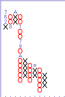
Point and Figure charts have several designations
the user should be familiar with.
- Within the rising and
falling columns of daily Point & Figure charts there are letters and
numbers. Since Point & Figure charts technically don’t include ‘time,’
these designations are used for reference. January through September correspond
with 1- 9 and A, B, C are assigned to October through December respectively.
See below:
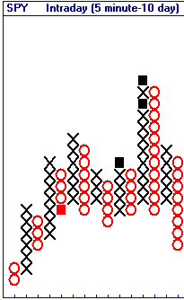
- Within the rising and
falling columns of intraday Point & Figure charts there are colored
squares. These markings designate the beginning of a new trading session.
See below:
|
|
Study Line Width
|
This gray field is adjustable with the up or down arrows to the right
of the field. The higher the number, the bolder the line in the chart.
NOTE:
A
higher setting may cause distortion to the graph.
|
|
Data to show
|
Specify the number of days to display in the chart at any one time.
NOTE:
This
is only applicable when the Show all data field is unchecked.
|
|
Show all data
|
If checked, shows chart for the time frame specified in the Range (days).
If unchecked, this will display what is indicated in the Data to show
field. A
scroll bar will appear at the bottom of the chart allowing you to move
back and/or forth through Range (days) selected.
|
|
Price scale ($'s)
|
Specify the increments for the price scale, from .05 to Auto or Logarithmic.
Once a price interval is selected (not Auto or Logarithmic), you can manually
input an interval. You should select an interval that is appropriate to
the price range of the security you are charting for the selected Range
(days).
- Default is Auto,
which allows the software to select the optimal scale based on the size
of the chart.
- Logarithmic,
or percentage, scaling will change the price scale's appearance by making
the vertical spacing between two points correspond to the percentage change
between those numbers. So, for instance, the vertical distance between
10 and 20 and the vertical distance between 50 and 100 will be the same.
This helps provide a truer picture of charts with large vertical ranges.
|
|
Show Last Trade Label
|
Highlights the last trade price in the Price Scale.
|
|
Show Price Scale on Left
|
The Default will display the Price Scale on the right. By
checking this field, the Price Scale will display on the left.
|
|
Show High, Low, Open, Close Values on Chart
|
When enabled, clicking a point on the chart will display the High, Low,
Open and Close values for that point directly over the chart.
When disabled, clicking a point on the chart will display the values
in a small separate window which can be moved around the screen.
|
|
Chart Type
|
Allows you to quickly change between Monthly, Weekly, Daily, and Intraday
charts.
The Settings >
General window determines how many days or intervals are displayed.
|
|
Back Test
|
You can change the Back Test settings when applying a Strategy to the
chart to see how having a different starting equity or trade quantity,
or adding commissions to the cost of the trades, will affect the outcome
of the test.
|
|
Fonts
|
Click to change the font style in the chart.
- When the Font box opens, select the type, style
and size.
- Click OK.
NOTE:
Large
font sizes may not allow for a clean view of the text displayed in the
chart.
|
|
Colors
|
To change the colors in a chart, select the item you wish to change,
then press the color button to change, and click OK.
|